Typographics
New York City’s Typographics is a design festival for people who use type. I was inspired by their 2023 instalment, using it as an opportunity to build a hypothetical visual identity for the festival.

This project involved creating a cohesive suite of designs that Typographics could use before, during, and after the festival. I took an emotionally driven approach, starting with a well-defined brief that guided both our creative direction and design process.
The concept: Typographics is an outlet to celebrate, showcase and learn about type; ‘a design festival for people who use type’. We want people to feel included, inspired and enthusiastic. The festival’s presence of passion for type and creativity combined with its delivery of academia about type make it a crossroads between work and play. Through our type-focused designs, our goal is to assist Typographics in representing an inclusive and inspiring festival that peppers the essence of passion with academia throughout.
What?

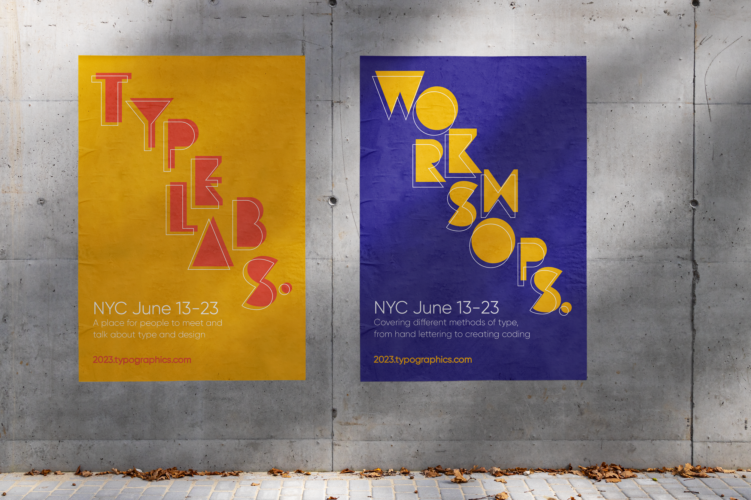
At the heart of the concept was a desire to evoke feelings of inclusivity, inspiration, and enthusiasm. One of my key design strategies was to explore the use of shapes and letterforms in a non-linear, unconventional way. By abstracting letters to the point where they almost became shapes, I discovered a playful, dynamic and puzzle-like quality in their arrangement. This allowed me to create compositions that felt energetic and layered, while still being approachable. The careful configuration of these elements helped strike a balance—bold enough to inspire, yet considered enough to remain inclusive.
Why?


The strength of this project lay in its conceptual foundation. To avoid outcomes that felt arbitrary or disconnected, I developed a clear set of rules that guided the entire suite of designs. These principles provided consistency while still allowing room for creative exploration. Beyond those basic constraints, the process was deliberately experimental, playing with the expressive nature of letterforms and how their unique shapes could inform placement and interaction. This balance between structure and spontaneity not only brought energy to the work but also reflected the curiosity and creativity of the festival audience—designers, thinkers, and type enthusiasts.